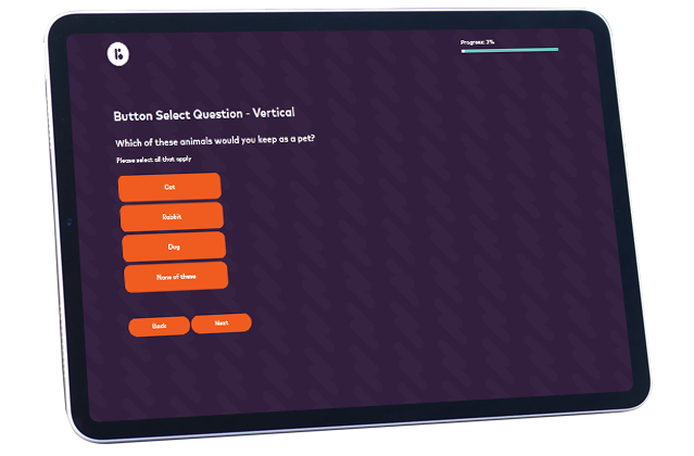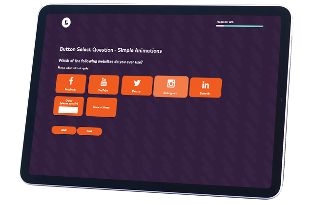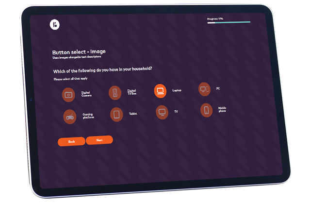
Forgive us if this sounds a little obvious. A button is typically text surrounded by a coloured shape that stands out from the background. Button Select is as simple as it sounds, it presents respondents with a number of options and asks them to select which are relevant.


This is a great option if your audience will primarily interact on mobile. The large style of buttons makes them easier to select, even on smaller screens.
While it can be tempting to have different options represented by different colours, this may actually skew your results by drawing the eye to certain options, much in the way respondents will more often choose an option placed at the start of list. You should randomise the order of the options and use a uniform colour for any buttons, perhaps one that matches your branding.
Variety is the spice of life and wherever possible you should try and use a mix of different question types to keep any survey engaging.
