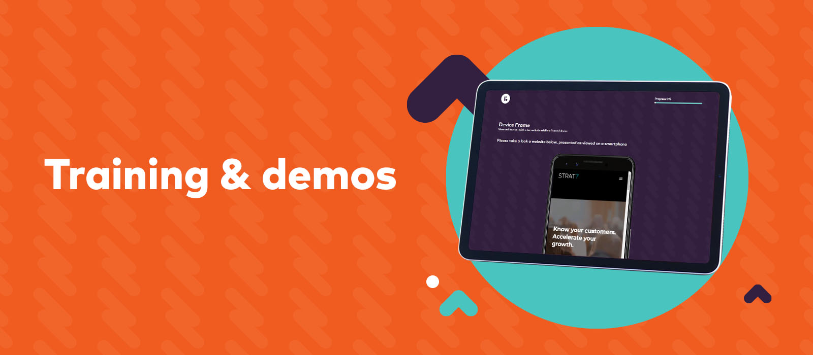
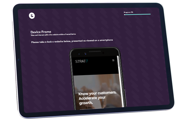
Most websites are developed with a responsive design framework that will change depending on the user’s device. With the range of screen sizes ever increasing and new formats and technology popping up, the truth is that one size quite often does not fit all. That’s why Device Frames can be so useful. Get people to view, test and feedback on your live website in a variety of formats.
You may need to contact your site owner in order to give us permission to pull your website into a survey.
When users can easily find the information they’re looking for on their own, it decreases frustration and improves their experience. Set respondents a specific task on the website, so for example finding out information about a product. You can then follow up with how easy it was for them to find that information etc
If you’re developing a new website, then be sure to test a few different design iterations. By involving real users early on it can help you to solve problems you may not have been aware of and see the reality of how users navigate your site.
Variety is the spice of life and wherever possible you should try and use a mix of different question types to keep any survey engaging!