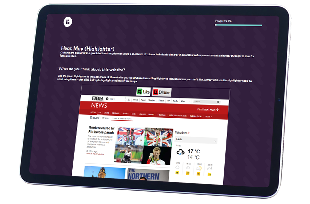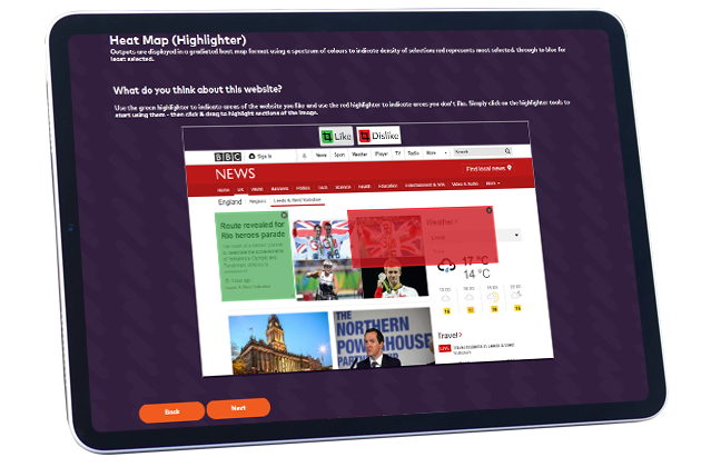
We take your websites, magazine covers, adverts, tweets, brochures and more and get respondents to select areas that stand out to them and ask why. This tells you which specific parts of your media are making an impact and if it’s a positive one or not!


Its so difficult to capture your audiences attention! Your assets need to flow nicely and highlight key information or drive the customer towards buying. Heatmaps can do just this for you, and they represent an interactive and interesting question for respondents.
Test out different visual designs, different colour mixes, different calls to action. With a graphical representation of data, you can quickly identify the respondents’ interests or the area of focus just by viewing the image.
Without heatmaps, it would be difficult to find out what respondents like within an image. Heatmaps tap this information well and convert qualitative data into quantitative. Market researchers can visualise heatmap data analysis and generate reports based on the responses.
Anyone who has ever applied heatmaps to their websites with online tools such as hotjar will know that generally speaking, the higher something is positioned on a website, the hotter it will be. While this may be statistically true it is not necessarily helpful. Where someone is more interested they will naturally scroll down and so using our heatmap tool can help you to better identify the content which stands out or is deemed more important.
Variety is the spice of life and wherever possible you should try and use a mix of different question types to keep any survey engaging!